本人在美工方面一直是比较白痴的,对于一些颜色什么乱七八糟的非常头痛,但是在Android编程中这又是经常涉及到的东西,没办法,只有硬着头皮上。
Android中常常使用shape来定义控件的一些显示属性,今天看了一些shape的使用,对shape有了大体的了解,稍作总结:
先看下面的代码:
<shape>
<!-- 实心 -->
<solid android:color="#ff9d77"/>
<!-- 渐变 -->
<gradient
android:startColor="#ff8c00"
android:endColor="#FFFFFF"
android:angle="270" />
<!-- 描边 -->
<stroke
android:width="2dp"
android:color="#dcdcdc" />
<!-- 圆角 -->
<corners
android:radius="2dp" />
<padding
android:left="10dp"
android:top="10dp"
android:right="10dp"
android:bottom="10dp" />
</shape>
solid:实心,就是填充的意思
android:color指定填充的颜色
gradient:渐变
android:startColor和android:endColor分别为起始和结束颜色,ndroid:angle是渐变角度,必须为45的整数倍。
另外渐变默认的模式为android:type="linear",即线性渐变,可以指定渐变为径向渐变,android:type="radial",径向渐变需要指定半径android:gradientRadius="50"。
stroke:描边
android:width="2dp" 描边的宽度,android:color 描边的颜色。
我们还可以把描边弄成虚线的形式,设置方式为:
android:dashWidth="5dp"
android:dashGap="3dp"
其中android:dashWidth表示'-'这样一个横线的宽度,android:dashGap表示之间隔开的距离。
corners:圆角
android:radius为角的弧度,值越大角越圆。
我们还可以把四个角设定成不同的角度,方法为:
<corners
android:topRightRadius="20dp" 右上角
android:bottomLeftRadius="20dp" 右下角
android:topLeftRadius="1dp" 左上角
android:bottomRightRadius="0dp" 左下角
/>
这里有个地方需要注意,bottomLeftRadius是右下角,而不是左下角,这个有点郁闷,不过不影响使用,记得别搞错了就行。
还有网上看到有人说设置成0dp无效,不过我在测试中发现是可以的,我用的是2.2,可能修复了这个问题吧,如果无效的话那就只能设成1dp了。
padding:间隔
这个就不用多说了,XML布局文件中经常用到。
大体的就是这样,以下是一个使用的具体示例:用在Selector中作为Button的背景,分别定义了按钮的一般状态、获得焦点状态和按下时的状态,具体代码如下:
main.xml:
<Button
android:layout_width="wrap_content"
android:layout_height="wrap_content"
android:text="TestShapeButton"
android:background="@drawable/button_selector"
/>
button_selector.xml:
<?xml version="1.0" encoding="utf-8"?>
<selector
xmlns:android="http://schemas.android.com/apk/res/android">
<item android:state_pressed="true" >
<shape>
<!-- 渐变 -->
<gradient
android:startColor="#ff8c00"
android:endColor="#FFFFFF"
android:type="radial"
android:gradientRadius="50" />
<!-- 描边 -->
<stroke
android:width="2dp"
android:color="#dcdcdc"
android:dashWidth="5dp"
android:dashGap="3dp" />
<!-- 圆角 -->
<corners
android:radius="2dp" />
<padding
android:left="10dp"
android:top="10dp"
android:right="10dp"
android:bottom="10dp" />
</shape>
</item>
<item android:state_focused="true" >
<shape>
<gradient
android:startColor="#ffc2b7"
android:endColor="#ffc2b7"
android:angle="270" />
<stroke
android:width="2dp"
android:color="#dcdcdc" />
<corners
android:radius="2dp" />
<padding
android:left="10dp"
android:top="10dp"
android:right="10dp"
android:bottom="10dp" />
</shape>
</item>
<item>
<shape>
<solid android:color="#ff9d77"/>
<stroke
android:width="2dp"
android:color="#fad3cf" />
<corners
android:topRightRadius="5dp"
android:bottomLeftRadius="5dp"
android:topLeftRadius="0dp"
android:bottomRightRadius="0dp"
/>
<paddinghttp://
android:left="10dp"
android:top="10dp"
android:right="10dp"
android:bottom="10dp" />
</shape>
</item>http://
</selector>
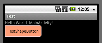
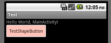
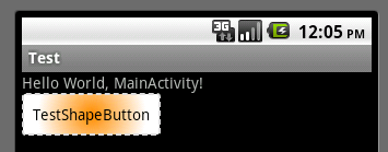
运行效果如下图:
一般状态:
获得焦点状态:
按下状态:
分享到:


相关推荐
Android中使用Shape自定义形状
android中shape的使用: http://blog.csdn.net/luohai859/article/details/41038443
主要介绍了android shape的使用及渐变色、分割线、边框、半透明阴影,小编觉得挺不错的,现在分享给大家,也给大家做个参考。一起跟随小编过来看看吧
android-shape-imageview - 图片圆角、三角、五角、圆形、多角
Android-shape标签的使用,让我们的界面更加高大上档次
android 用shape画出来的颜色做背景时,动态的改变它的颜色属性。
探索Android中selector和shape的结合使用
利用shape优化android UI
android shape的使用
android 代码实现shape GradientDrawable
Android控件美化之Shape的使用 里面事例非常好的。
Android shape属性详解
Android:shape的使用详解(2)http://blog.csdn.net/wangyanguiyiyang/article/details/50060829
Android shape 属性深入用法 我的博客:http://blog.csdn.net/xiaoyuan511
详细信息可见博客,Android:shape开发详解-UI设计
android shape可以帮助我们实现很多的效果,比如:圆角、虚线边框、部分圆角、颜色的渐变等效果,同时源文件给出了android4.0系统下虚线会变成实线的解决办法。
Android中常常使用shape来定义控件的一些显示属性,接下来通过本篇文章给大家介绍Android中shape定义控件的使用,对android shape定义控件相关知识感兴趣的朋友一起学习吧
Android shape的使用demo,非常简单,适合新手;是这篇博客(http://blog.csdn.net/u024496289/article/details/41924425)的demo代码